Lunch Crunch
DELIVERABLES: BRAND IDENTITY AND PACKAGING DESIGN
The ‘Creativity Design Innovation’ module during my masters required my team to develop a product that does not already exist in the market. Out of the 17 goals listed by the United Nations Department of Economic and Social Affairs Sustainable Development, this product focuses on the 11th goal, that is, sustainable cities and communities. In order to create a sustainable impact through a product, the team developed a protein bar named “Lunch Crunch” that uses SCP’s as the base ingredient.


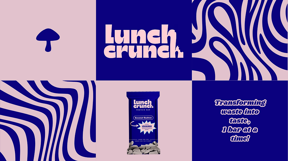
As the design lead for the Term One Creativity Project, I steered the team in developing a standout brand identity and groundbreaking packaging for our prototype product. Guiding the creative process, I fostered an environment of innovation, resulting in a fresh take on commercial design.

Throughout two terms of studying MSc Marketing Strategy and Innovation, I applied my skills in branding to design a compelling identity for our study group. The carefully crafted brand not only distinguished us but also garnered attention during pitches and presentations. Professors and founders recognized the strategic alignment, showcasing my ability to seamlessly integrate coursework with practical applications in branding, thereby elevating the study group's profile.


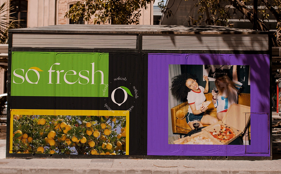
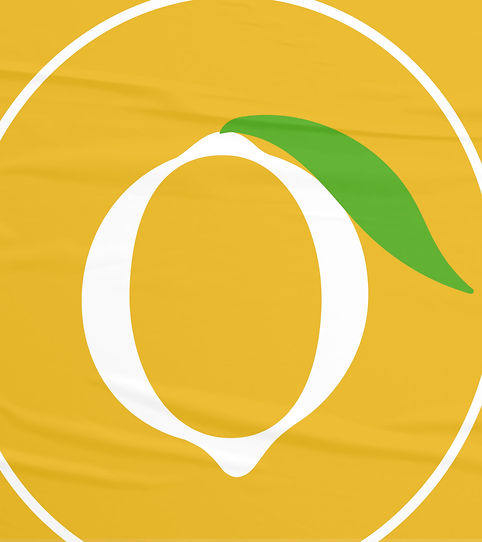
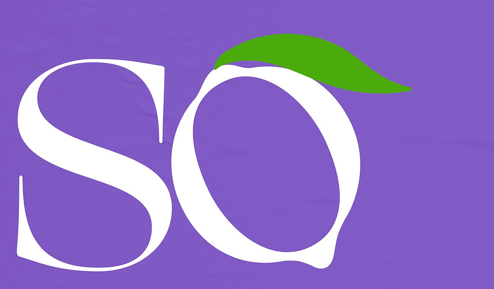
So Fresh is a food delivery service providing comfort food made with fresh ingredients and a whole lot of love. Italy being the birthplace of pizza, reminds you of the freshness of the ingredients and love put in into the cooking. That is what 'So Fresh' stands for.
The founders were inspired to build this brand upon their trip to Sorrento, Italy. Bringing the same taste to New Delhi, you are transported to the Southern Coast of Italy, relaxing in the morning sun at a beach. Having a bright colour palette and modern approach to the design fundamentals, elements like a lemon slice were brought to use. Yellow and Green came out to be the perfect colours for the face of 'So Fresh', at the same time paying a tribute to the Southern Coast of Italy. Showcasing the freshness of lemons and comfort of sea - freshness and comfort, also what 'So Fresh' serves, manifests and stands for as a brand.
Deliverables : Brand identity, Logo design, Menu design